Preparing Västtrafik’s ticket machines for the accessibility directive
According to the study “Funktionshindrade och kollektivtrafik”, more than half of people with disabilities experience problems with payment when using public transportation. Västtrafik’s card readers, in particular, fall short for individuals with visual impairments.
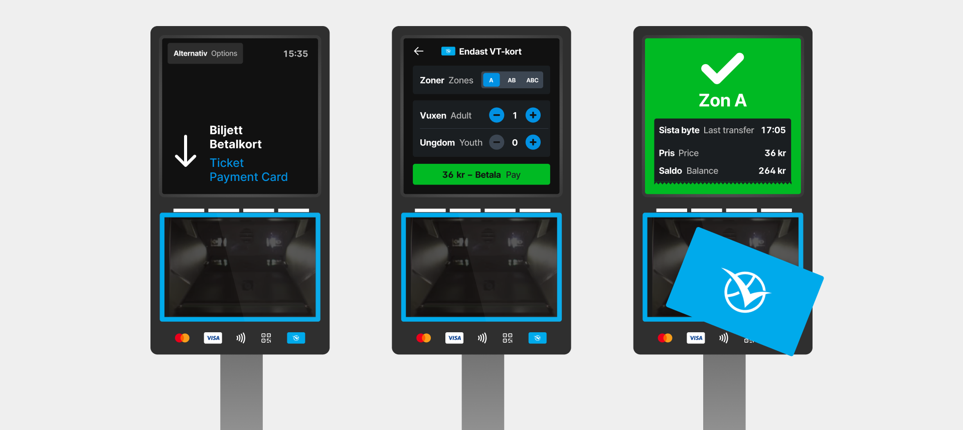
With the EU Accessibility Directive set to take effect in 2025, requiring public transport ticket machines to provide multi-sensory access to information, my goal during this school project was to redesign Västtrafik’s ticket machine to make it more inclusive.
 UX Designer
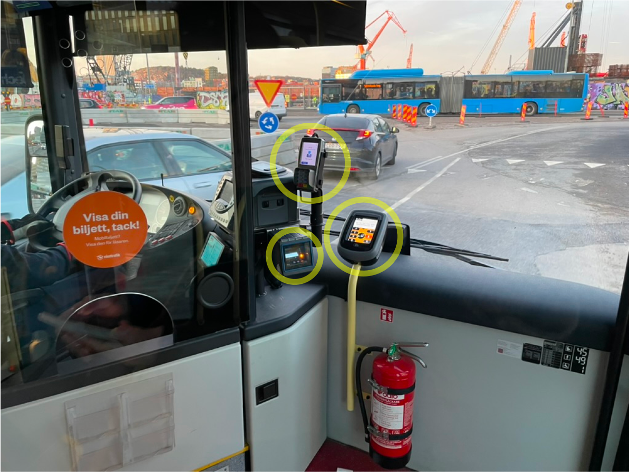
Three different ticket readers
When boarding a bus, passengers are confronted with three separate ticket readers which can be particularly challenging for individuals with visual impairments. This highlights how visually dependent the current system is and how it complicates the boarding process.
Moving from 70 to 3 zones
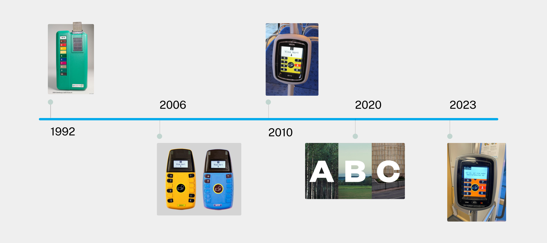
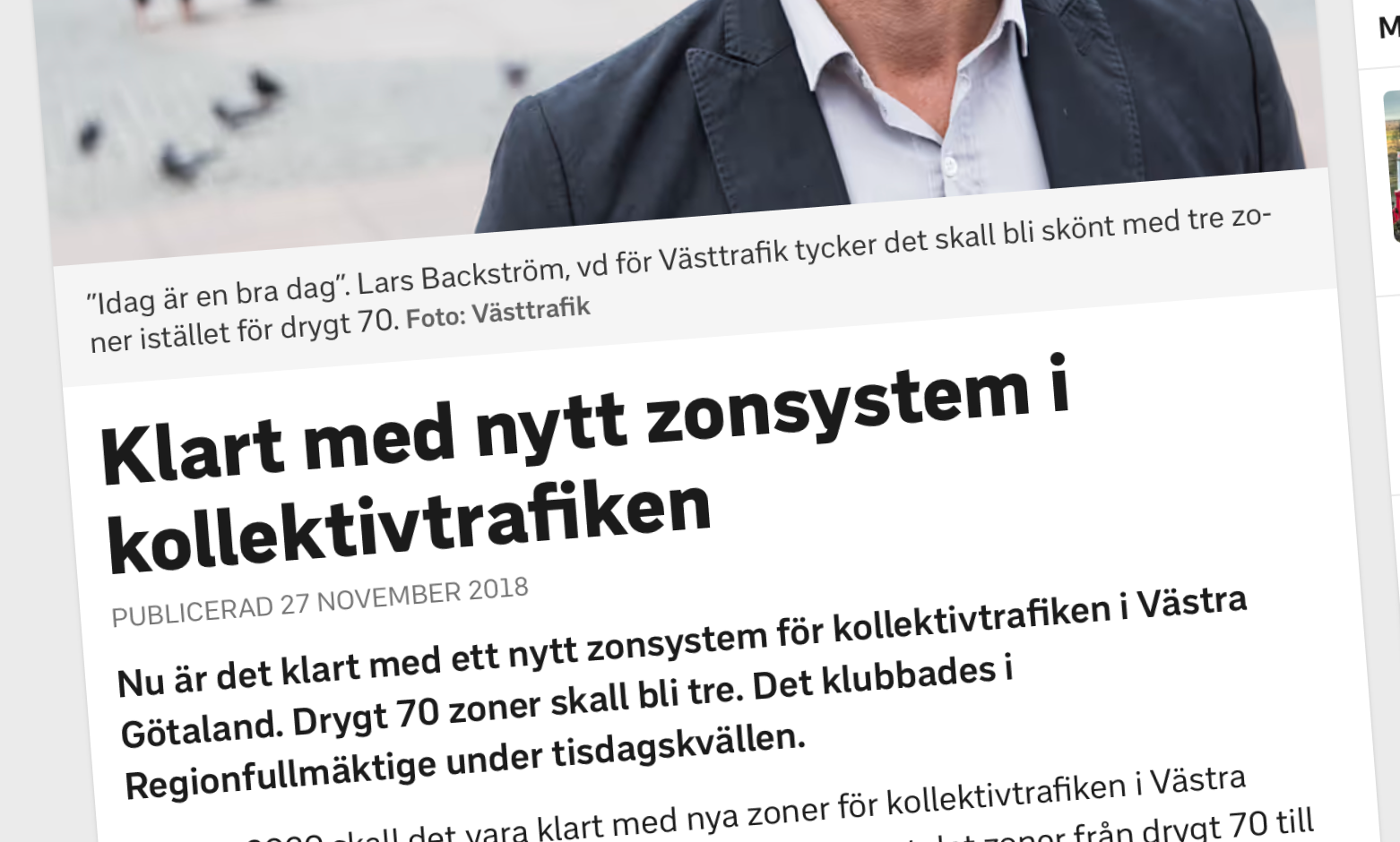
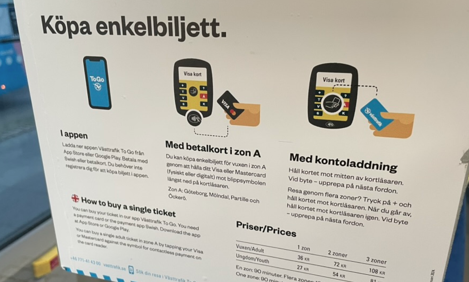
The current ticket machine remains largely unchanged since its introduction in 2010. To travel across multiple zones, passengers must press the “+” button and scan their card. Upon getting off, they need to remember to scan the card again. While this process might have been helpful when there were 70 zones, it feels unnecessarily complicated now that the system has been simplified to just three zones.
Two scanning surfaces
A single card reader with two distinct surfaces for scanning creates confusion. Västtrafik cards allow passengers to purchase zone and group tickets, while credit cards are limited to single adult tickets for one zone only. The challenge was figuring out how to communicate these limitations to the user when all tickets are purchased on the same machine.
Taking a step back and bundling all machines into one
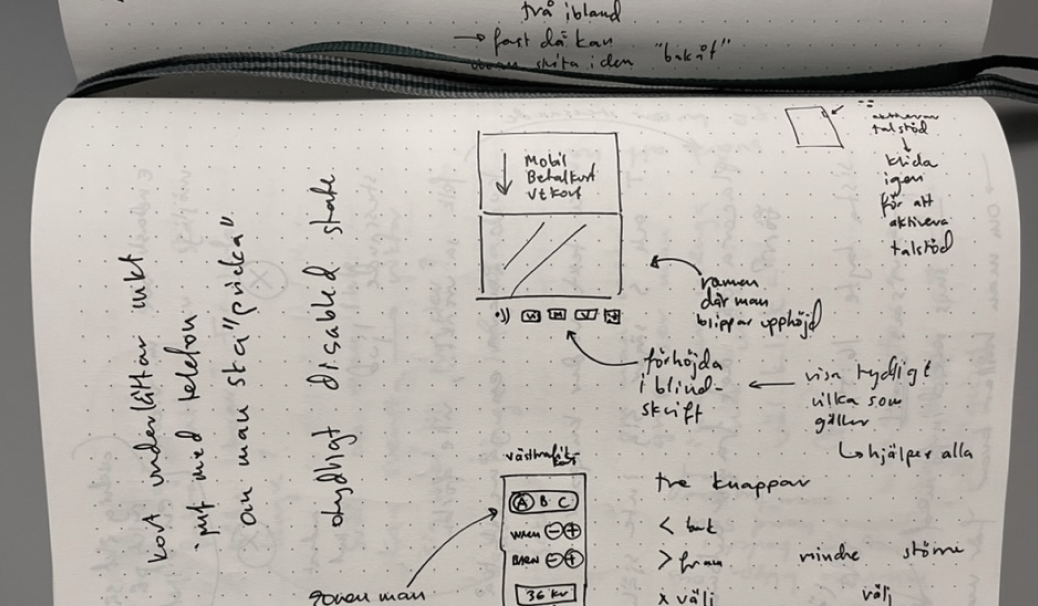
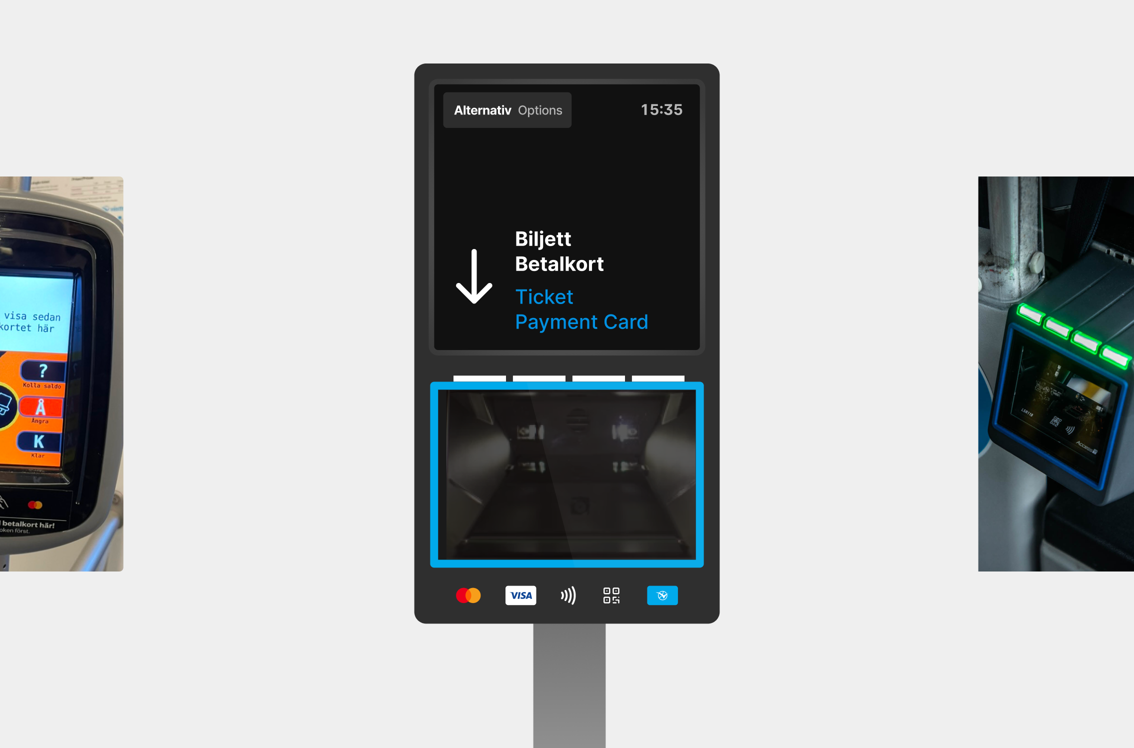
To address the issue of multiple card readers, I had to take a step back and consider integrating the QR code reader into the card reader I had set out to redesign. While this expanded the project’s scope, it provided an easier boarding experience. This approach also aligns with Västtrafik’s goal of integrating all ticket validation into a single reader.
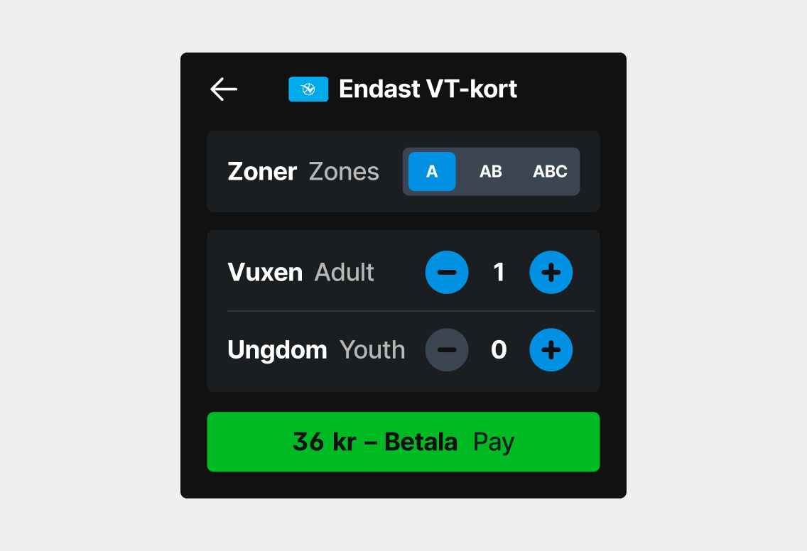
Balancing simplicity and ability to make settings
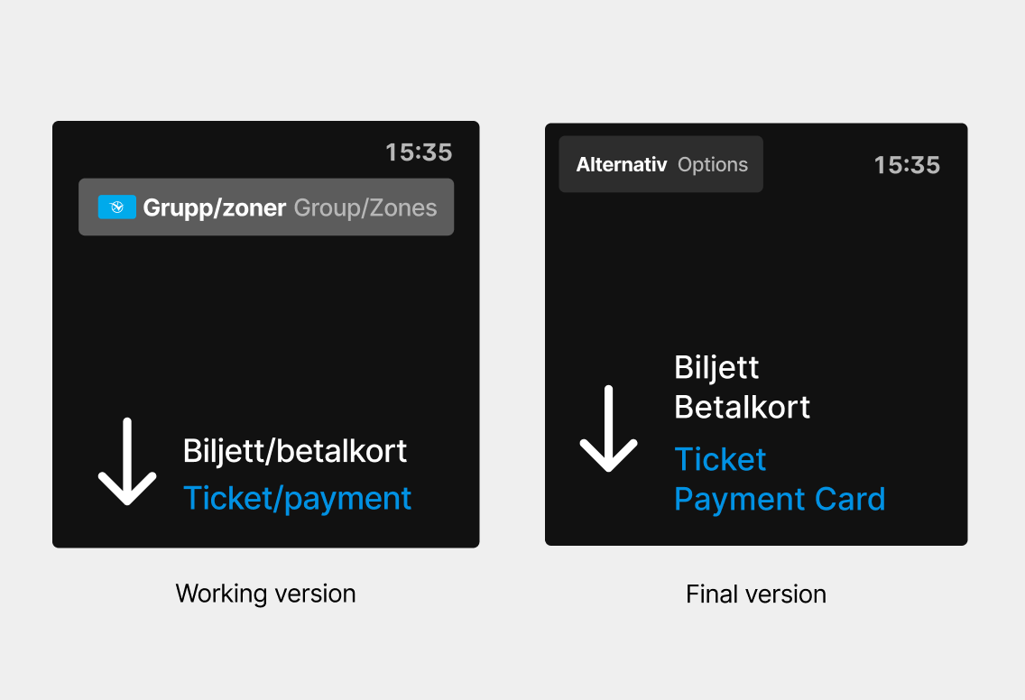
To simplify the interface for most users and avoid confusing those scanning a credit card, I chose to place the “Group/Zone” button under the “Options” menu. An earlier iteration displayed “Group/Zone” along with a Västtrafik card icon to clarify it only worked for such cards, but it was too dominant. Reflecting on this choice, I now wonder if an alternative—keeping the button text while adding an explanation step—might have been a better balance of clarity and functionality.

Making it accessible with two senses
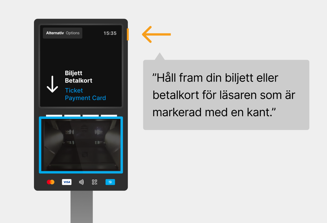
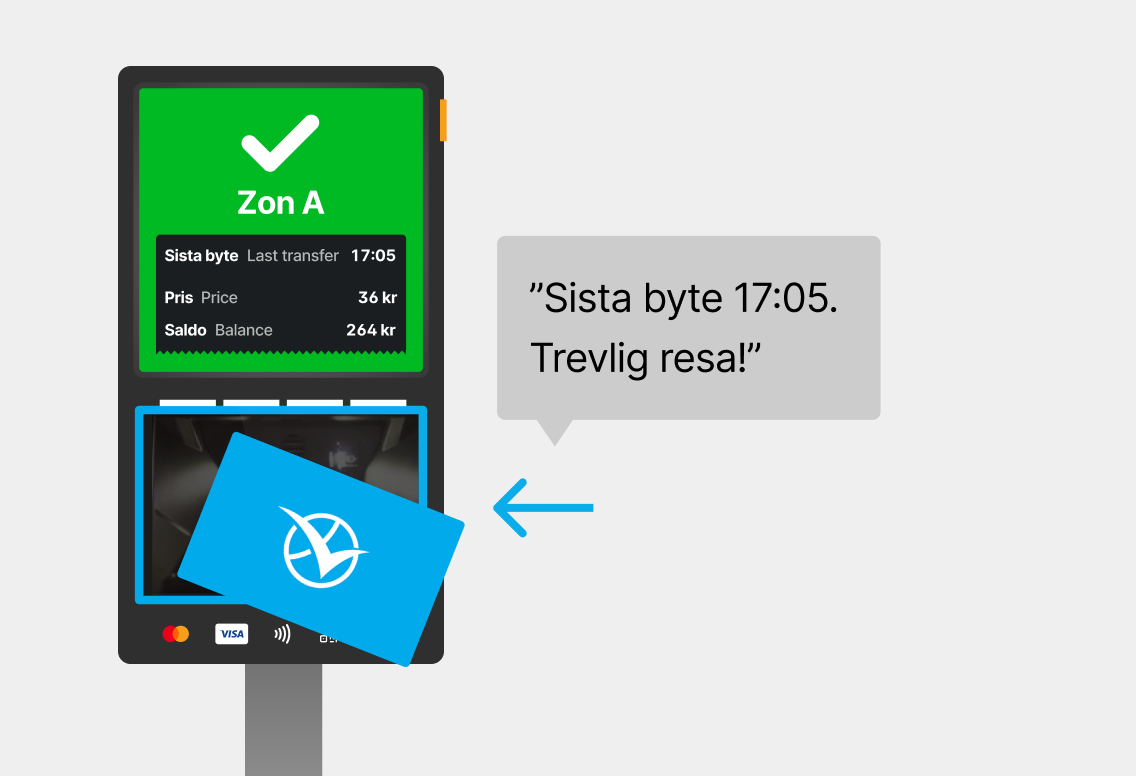
My suggestion to align to the directive was to add a button for audio assistance with instructions for basic functions. The blue frame around the card reader is tactile and slightly raised, making it possible to locate by touch. When a card is scanned, the user is notified if the ticket is valid and when the last transfer is. Due to privacy concerns, I decided not to provide audio support for group and zone tickets—users shouldn’t share travel details with all other passengers.
Key takeaways
- My ability to adapt to constraints set by an existing system and find the best possible solution within those limits.
- How toolkits like “Universal Design Personas” and “Ability Prompt Cards” can provide a helping hand when user testing isn’t possible within the timeframe.