Redesigning a web component for a real estate company to meet upcoming accessibility requirements
 UX Designer
Understanding how the promo block was used
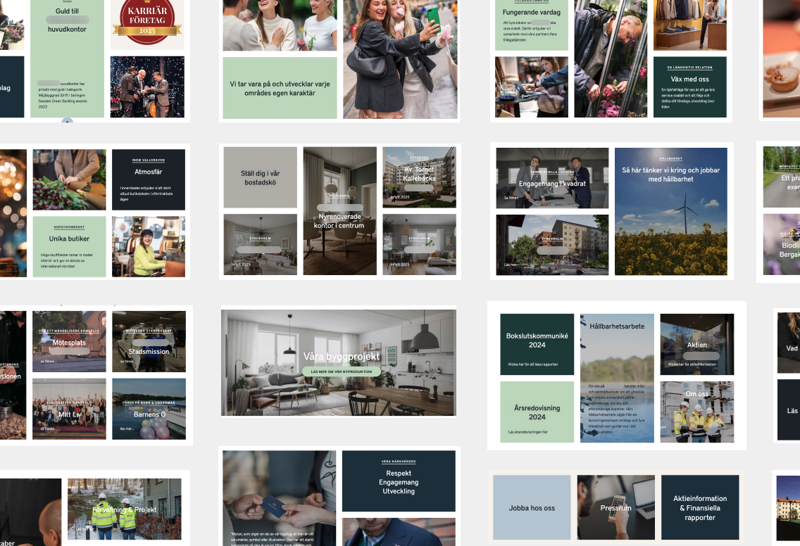
While analyzing the live website, I took screenshots of every instance of the component and organized them by usage. This helped me understand which scenarios my solution needed to cover. Since three variations of the component were in use, I wanted to map them all to explore opportunities for simplification and reducing the number of variants.
Addressing critical contrast issues
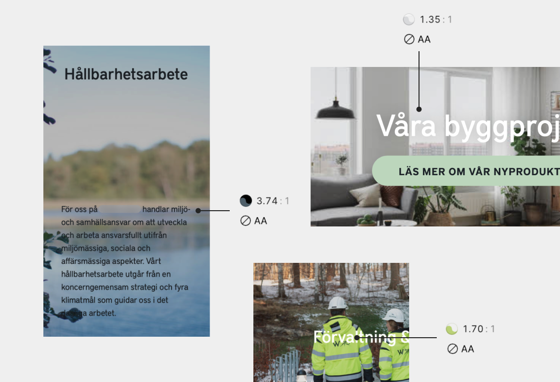
The primary accessibility concern was poor text contrast against image backgrounds. Content was difficult to read not only for visually impaired users but for everyone. Text placed directly on images became illegible when the background was similar in color to the text or contained busy patterns.
Doing a contrast analysis using accessibility tools I found that many instances failed to meet the minimum contrast ratio required for both small and large text.
Uncovering a related usability issue
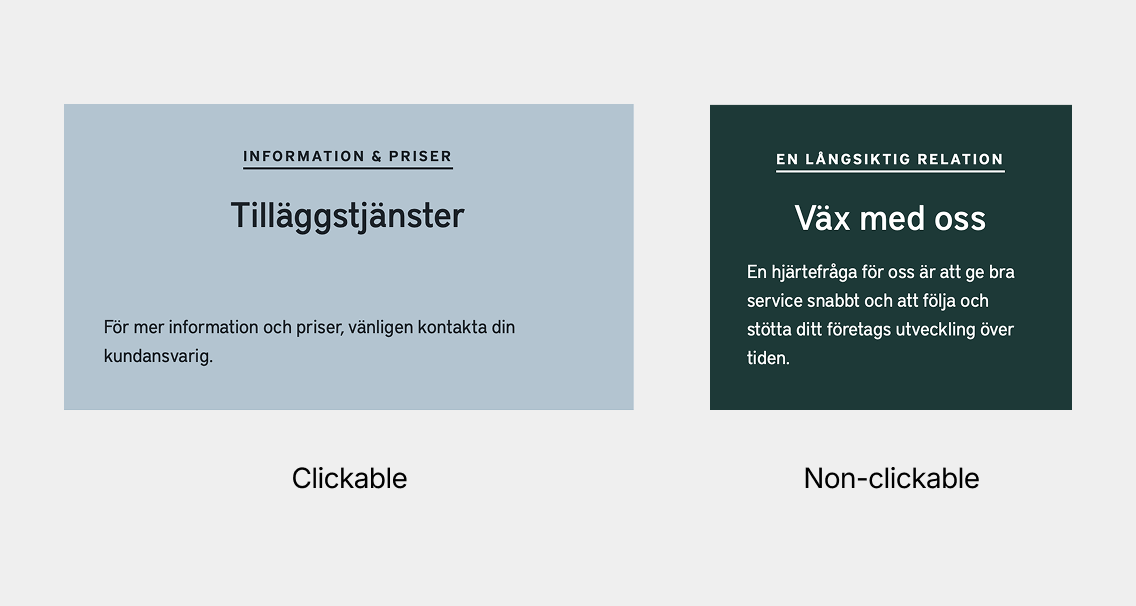
Beyond the contrast problems, I identified another critical issue: users couldn’t easily distinguish between clickable and non-clickable elements. This inconsistency could create confusion, since the same visual component was used for both interactive and informative content, without clear click targets like buttons or other visual cues to inform the user.
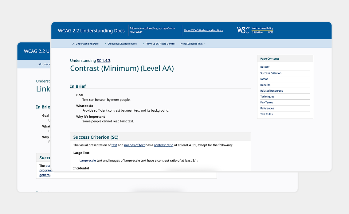
Researching WCAG requirements
To ensure compliance, I researched the specific WCAG requirements that affected these components:
- Contrast criteria (WCAG 1.4.3) – Text needs sufficient contrast against its background
- Link identification (WCAG 2.4.4) – Links must be clearly distinguishable
I also studied various techniques for achieving contrast requirements, reviewing resources such as the W3C’s documentation on failure and success techniques.
Presenting two solutions for the client
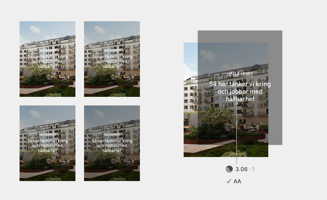
For the client presentation I showcased two solutions. For immediate implementation, I calculated the exact opacity needed for the overlay to meet contrast requirements. I determined that increasing the dark overlay to 42% opacity would ensure compliance across all background combinations.
However, I also demonstrated the drawbacks: not only would images that were already dark become even darker, but even with technically sufficient contrast, text could still be difficult to read over busy or detailed images.
Long-term solution: separating content from images
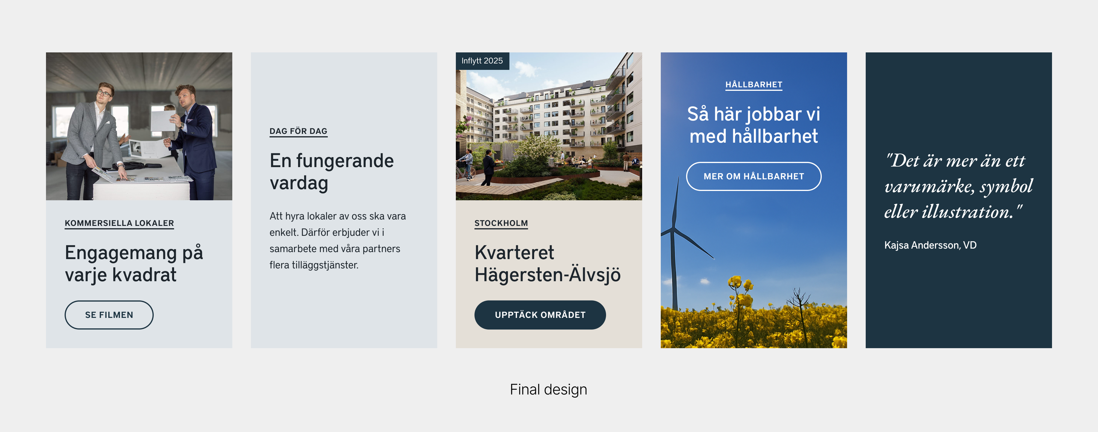
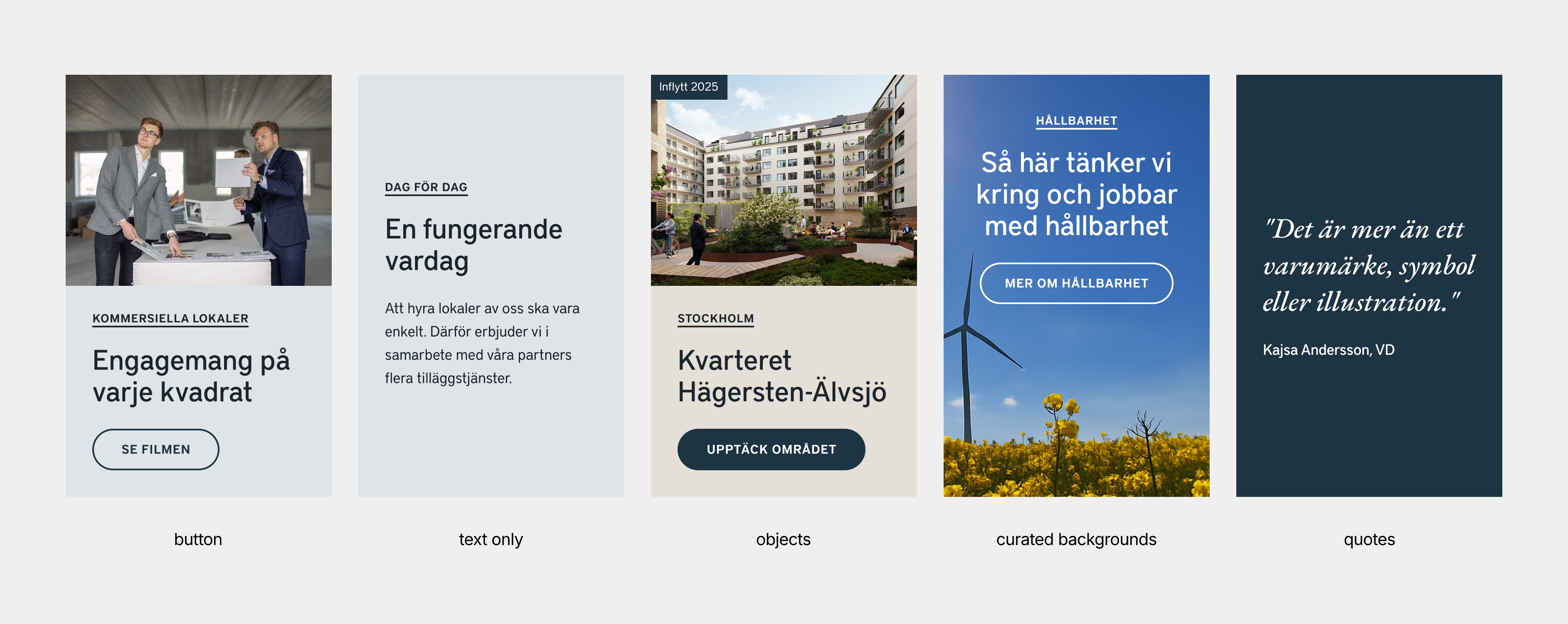
For a more sustainable approach, I proposed separating text from images completely by creating distinct content areas. This design not only solved the contrast issues but also improved overall design.
I also suggested clearly marking clickable blocks with buttons. Because this introduced a need for thoughtful UX copy, I also explored alternatives such as arrows after headings or subtle visual indicators that maintained the clean design while clearly communicating interactivity.
Balancing technical requirements with editor needs
Through conversations with stakeholders, I learned that the content editors valued the ability to use text on images to make the site feel dynamic. I realized that design changes that restricted this freedom needed to be balanced with new creative options.
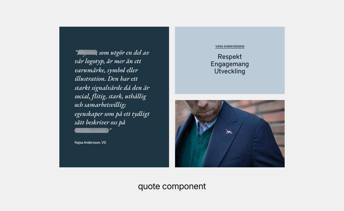
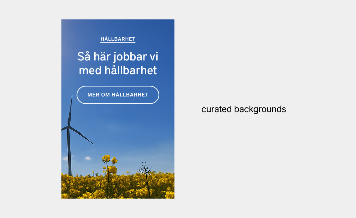
To address this, I proposed two new variants of the promo block featuring prominent quotes and a set of curated backgrounds with enough contrast. This gave editors additional ways for creating visual interest while maintaining accessibility compliance.
From design proposal to implementation
After presenting for the client I made some changes and handed over the project to the digital designer for refinement and alignment with the design system.
Key takeaways
- When accessibility means restricting creative options for editors, provide new ones as compensation.
- I learned that, had my time been more limited, the design handoff could probably have been done earlier and at a lower fidelity for the digital designer.