Communicating button states in a quiz app
Together with programming students, we had designed and developed a coded prototype of a quiz app using data from the Swedish Parliament’s open API. However, during the final usability tests, we discovered that users struggled to understand the app’s feedback.
After the school project ended, I tried to fix the confusing button states while also designing a new UI.
 UX
UX
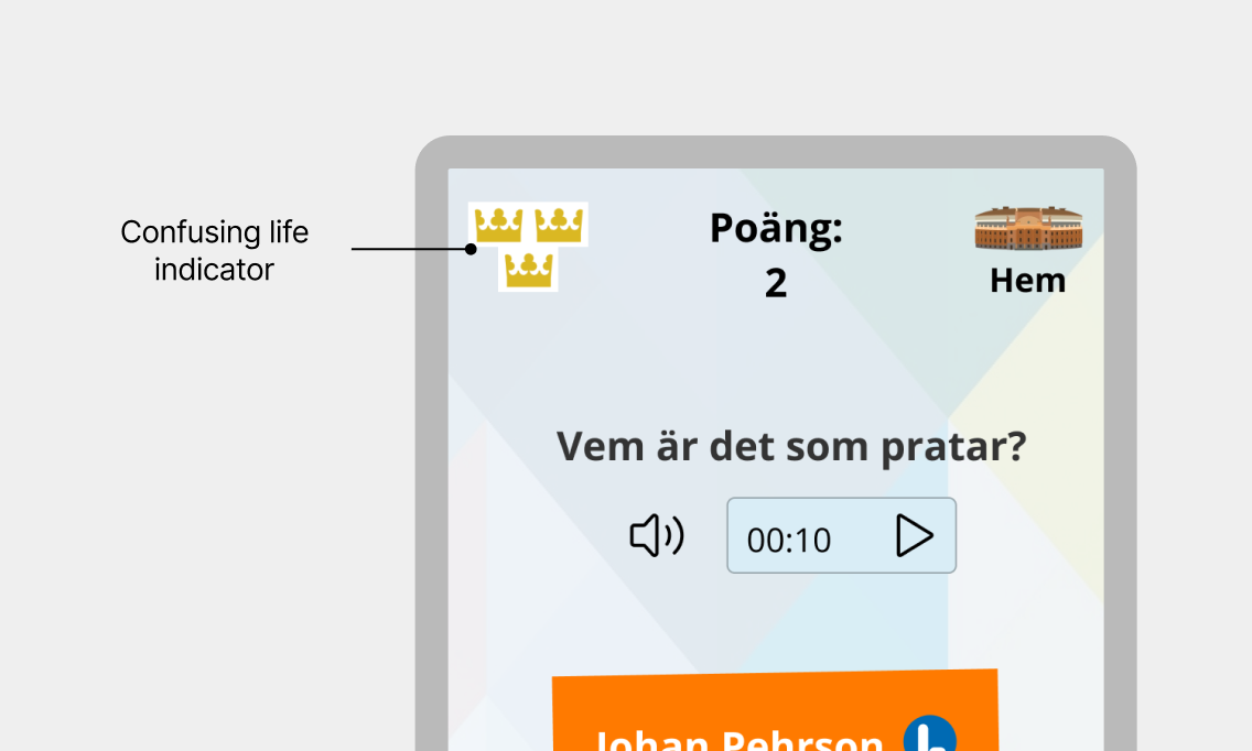
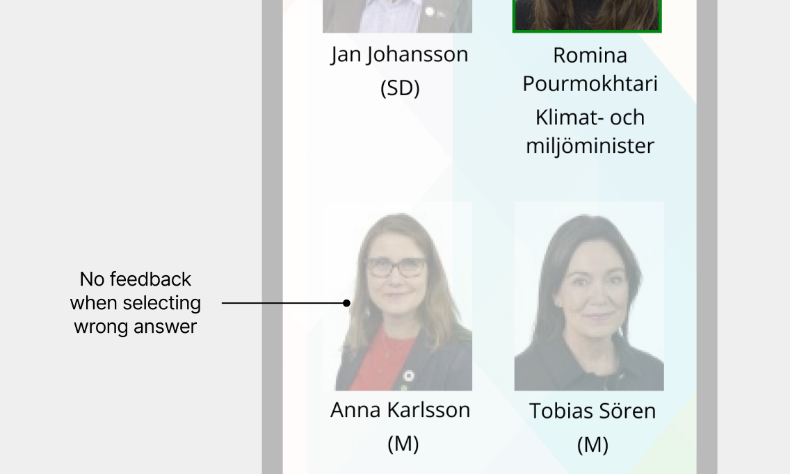
Key usability issues identified
- Unclear visual elements: Users didn’t understand that the crowns, inspired by the Parliament’s logo, represented lives in the game.
- Lack of feedback: When selecting an incorrect answer, users received no indication of their choice.
- Reduced learnability: In one question type users were immediately moved to the next question, removing learnability in the game.
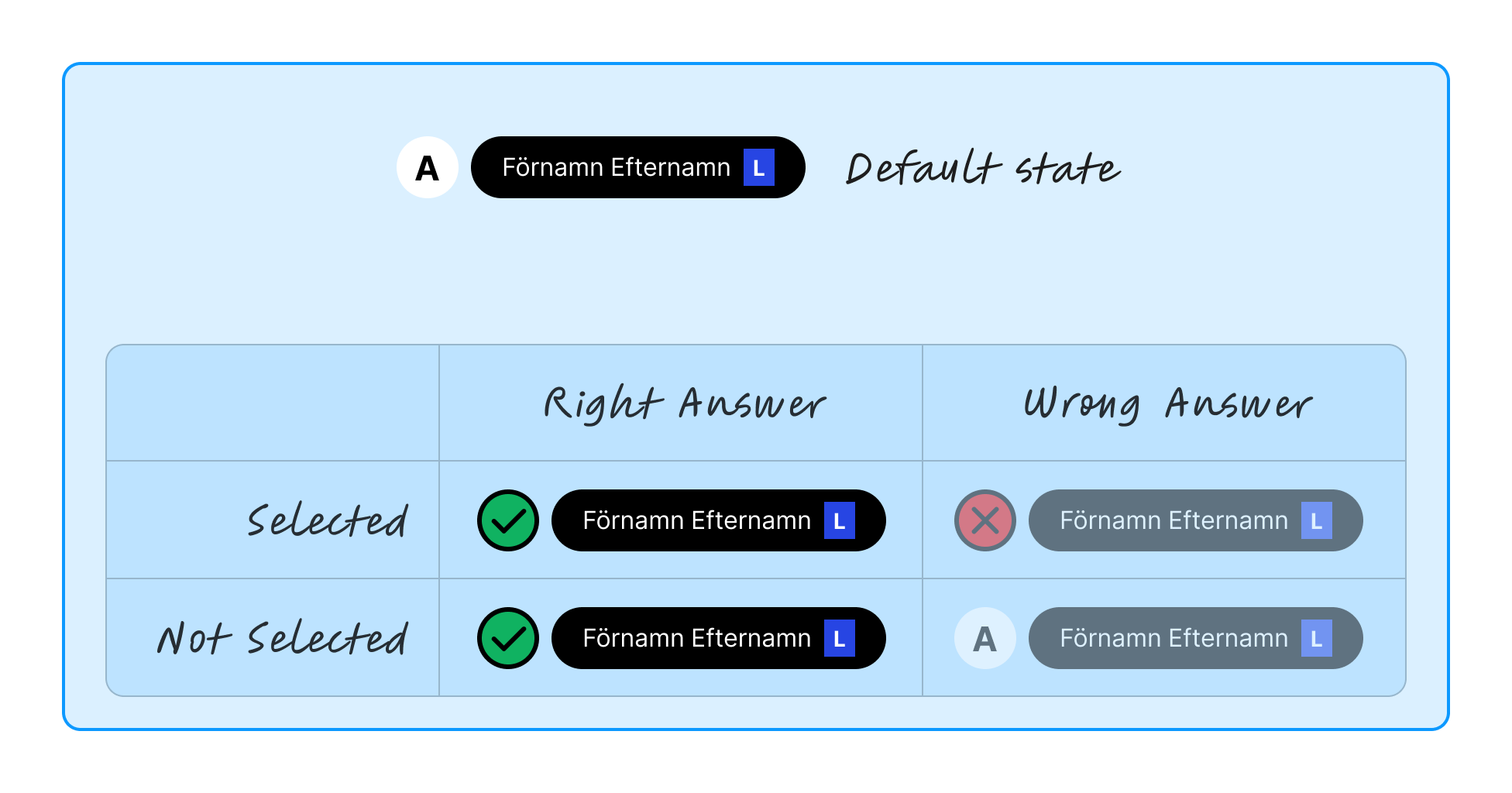
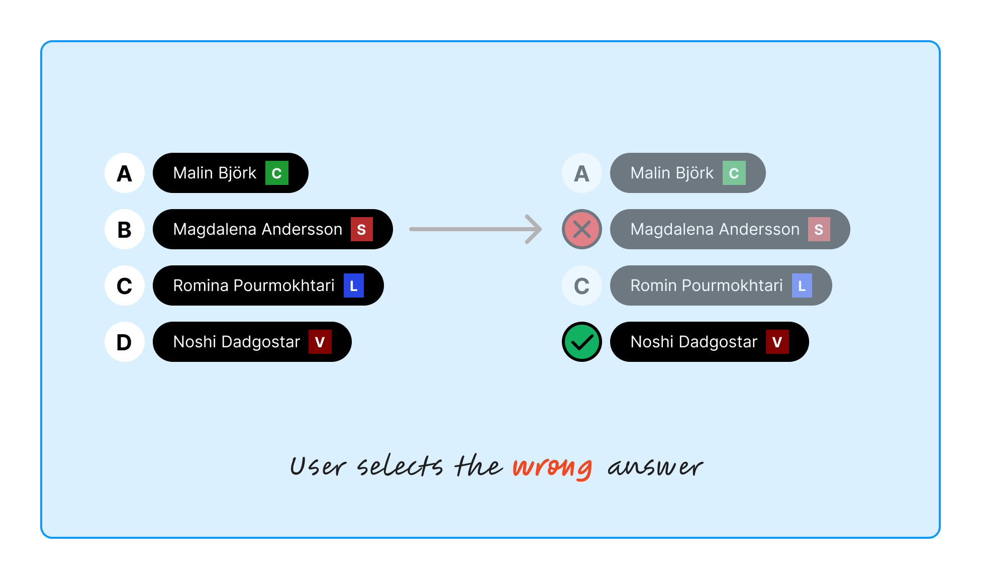
Mapping states for clearer feedback
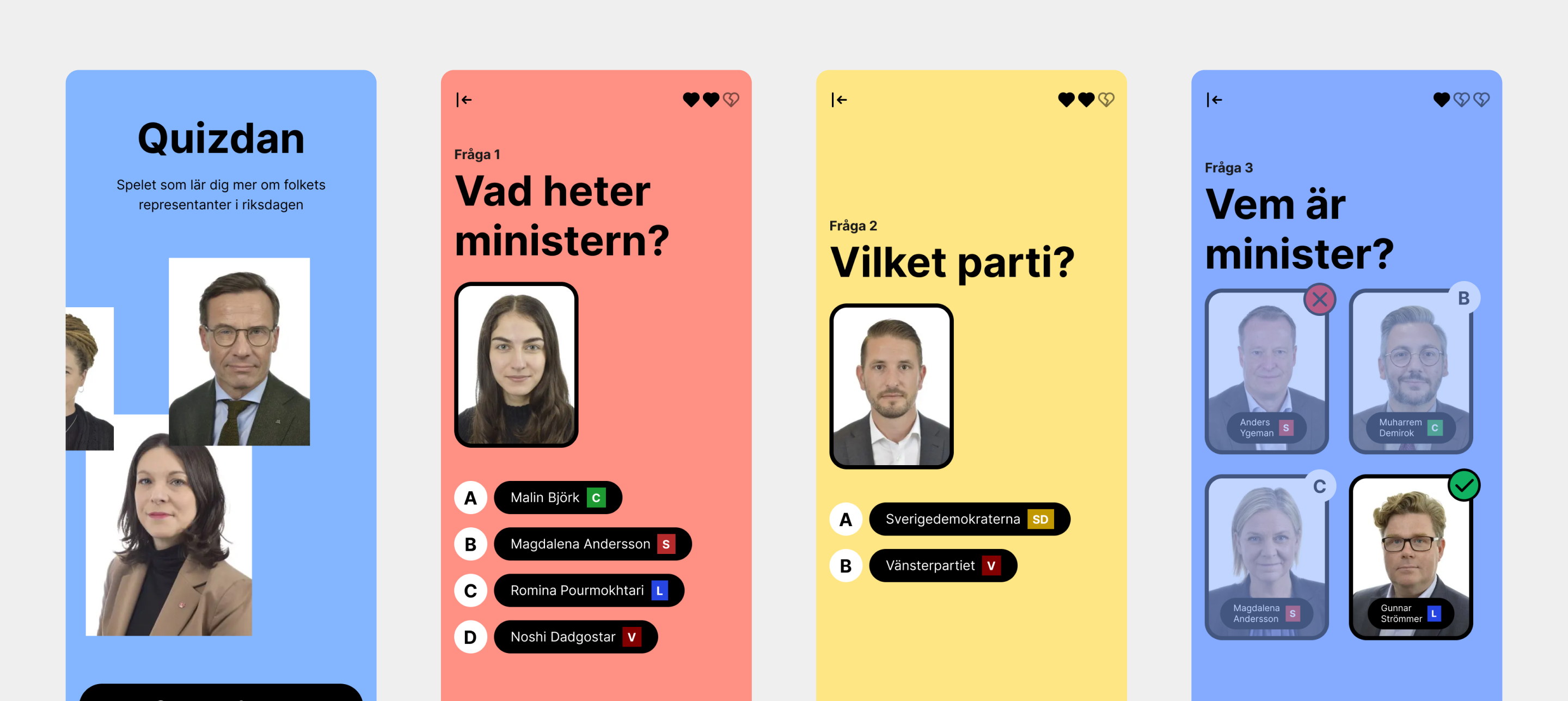
I started by mapping all possible states for the buttons and their interactions. This enabled me to determine how to effectively communicate feedback to users for both correct and incorrect answers. The design provides three types of feedback for incorrect answers and two for correct answers.
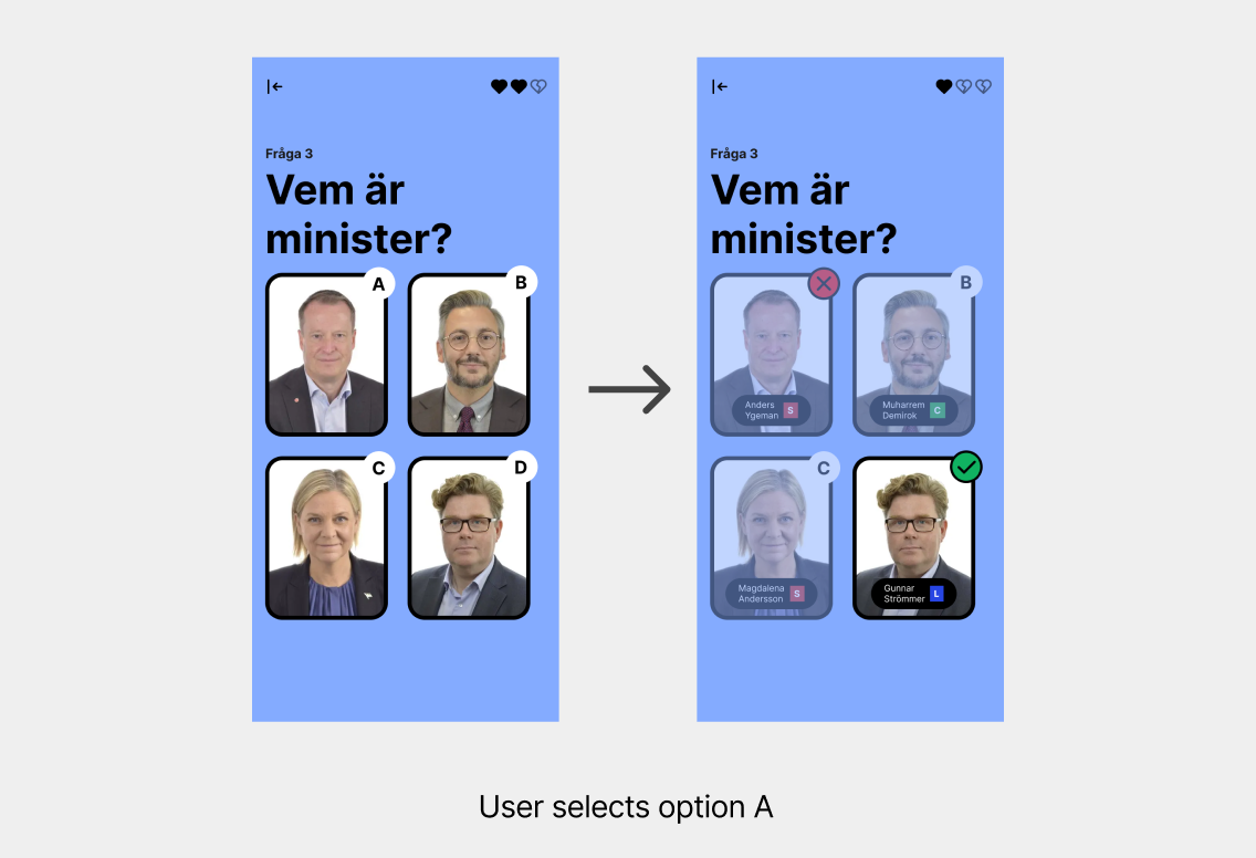
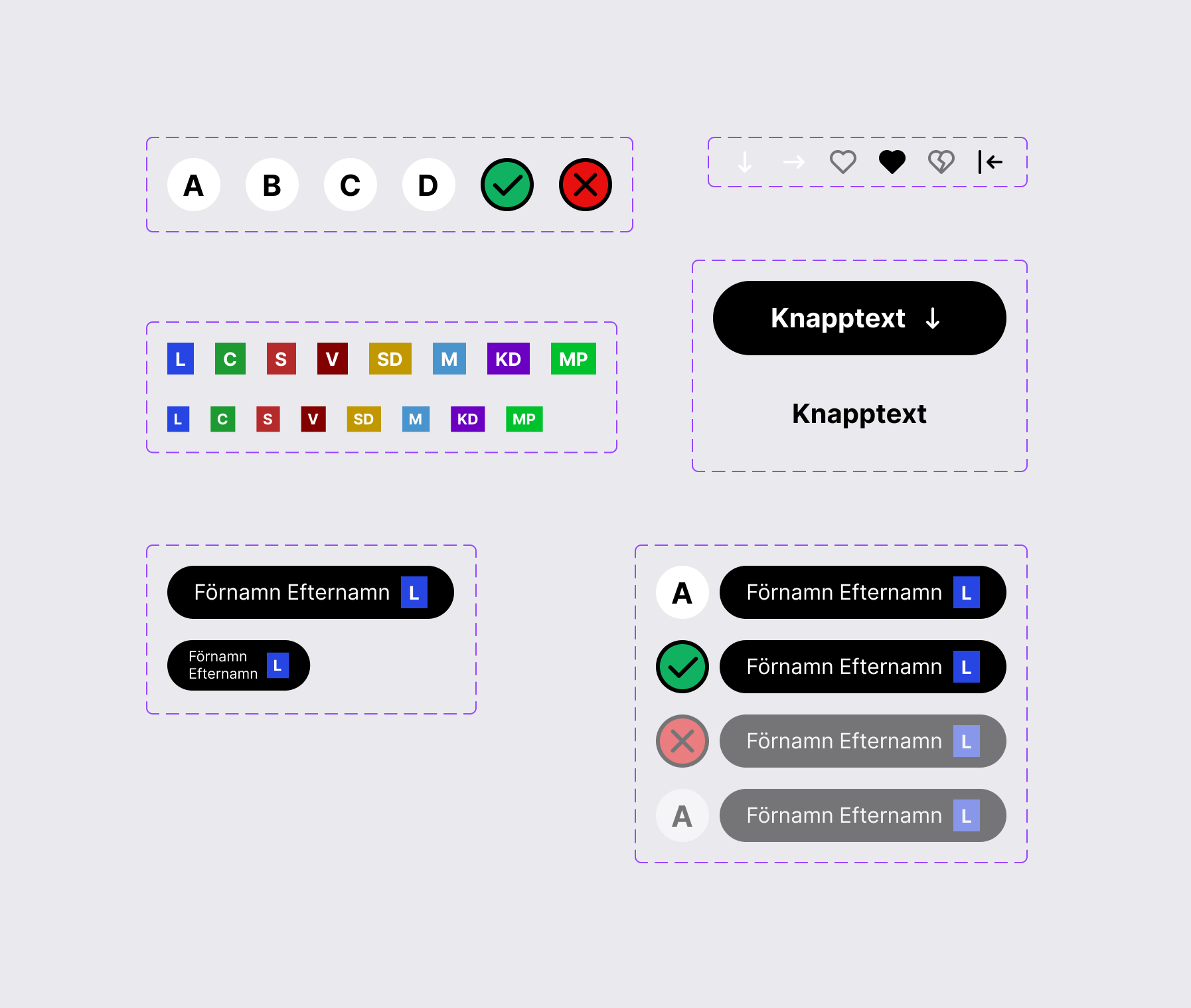
Updating visual design
To modernize the UI and improve usability, I made the following updates:
- Updated button styles to provide clear visual feedback for all interaction states.
- Incorporated accessible color schemes to enhance clarity and usability for all users.
- Used universally recognizable icons, such as hearts for lives, to ensure intuitive feedback.
Improved learnability for users
The redesigned quiz app now provides immediate and meaningful feedback, addressing the confusion observed during testing. Users can clearly understand both correct and incorrect choices, making the experience not only clearer but also more educational.
Key takeaways
- The first iteration provided valuable insights into user needs, and revisiting and refining the design based on that feedback resulted in a significantly better product.