Rethinking the information architecture for an internal tool at a leading automotive company
 UX Designer
Understanding the system’s complexity
I started by exploring the interface myself while interviewing key stakeholders who had been working with the project for years: the project manager and the lead developer.
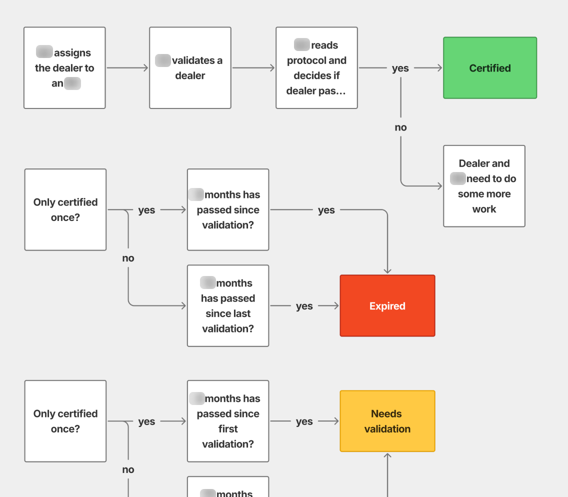
To validate my understanding, I created a flow diagram showing how dealers transition between different states in the system. I then reviewed and refined the diagram with the stakeholders.
Uncovering core issues
Through my initial analysis, I identified several critical problems:
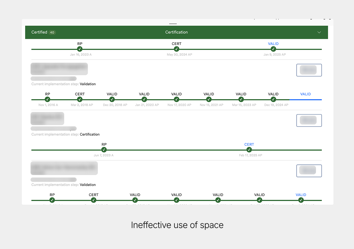
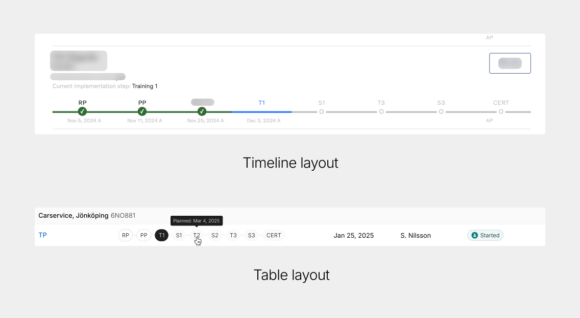
- Ineffective use of space: The interface relied heavily on a timeline layout, resulting in excessive whitespace and underutilized screen space
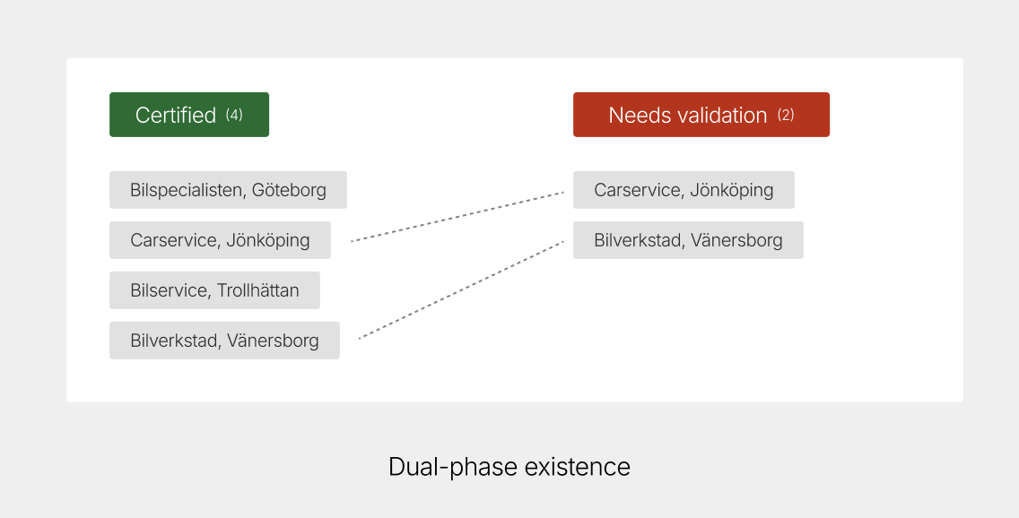
- Dual-phase existence: Dealers could exist in two different phases simultaneously, which caused confusion
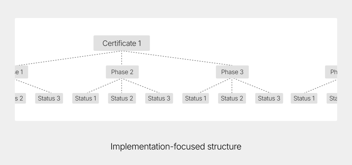
- Implementation-focused structure: The information architecture was not aligned with how the users approached their work, it rather followed a model close to the code structure
- Future scalability concerns: The system needed to accommodate additional implementation models in the future
Questioning the timeline design
While I initially began redesigning the timeline to make better use of the space and display more relevant information, I soon started questioning whether a timeline was the appropriate visualization method at all.
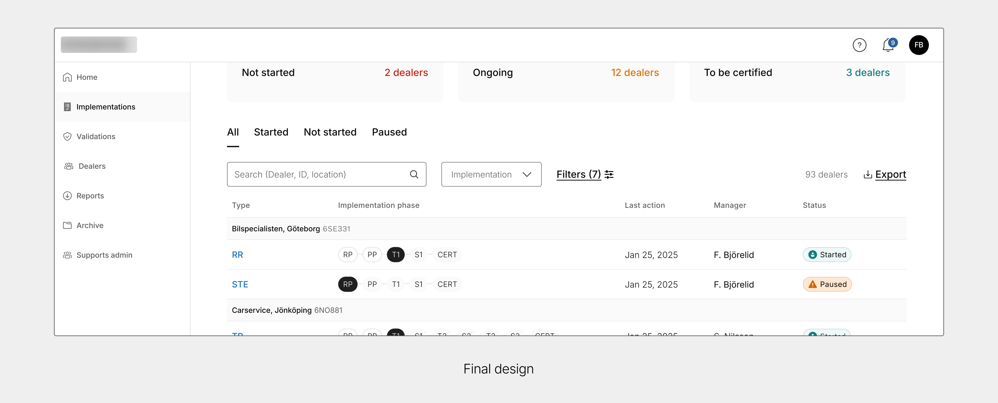
The timeline showed very little useful information, especially during the validation phase. This made me start experimenting and prototyping with a table format instead. A table could possibly show more relevant information at once and make it easier to scan. Leveraging the company’s design system I was able to quickly test my ideas.
Proposing a New Information Architecture
My solution involved a fundamental restructuring of the interface hierarchy:
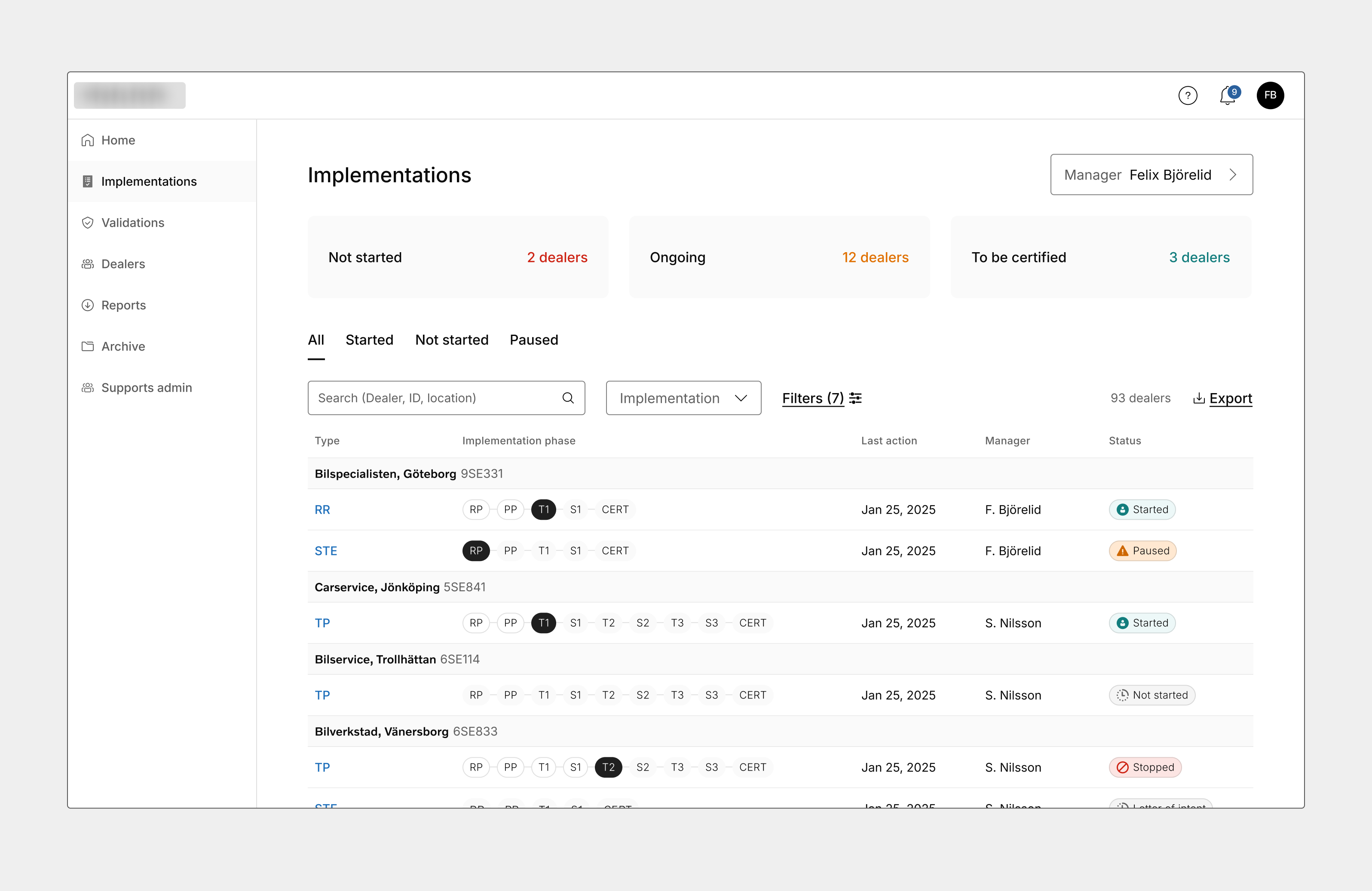
- Simplified phase structure: Consolidating the original three phases into two, making these the top-level organizing principle
- State-focused second level: Shifting the focus to statuses at the second level of the hierarchy
- Task-oriented approach: Designing the interface around user tasks rather than system implementation
Developing a prototype and testing it
I presented the proposed redesign to the product owner and key stakeholders, who were very positive. The next step was to gather insights from users, but with limited resources, the client was hesitant to conduct interviews at this stage. To still gather early insights, I created a clickable prototype highlighting the suggested changes and shared it along with a feedback form.
Next steps
The next step is to compile and analyze the feedback. Currently we’re planning interviews and a workshop with end users to better understand what information they need at specific stages of the process.
Key Takeaways
- How important it is to understand the underlying technical logic in order to bridge the gap between the implementation and the user’s mental model.
- Rapid prototyping helps build momentum: Creating a prototype early in the process helped us spark discussion, get buy-in across the organization, and collect valuable input.